CHARTS AND GRAPHS
Using Charts and Graphs
Pie Charts
Pie charts can also be used to convey parts of a whole, and as such, the data in the chart should all add up to 100 percent. They should be styled similarly to the doughnut chart, but will feature no white circle on top of the chart. Pie charts should be used when the chart would be so small that the ring of a doughnut chart would cause legibility issues. Pie sections should be organized starting at the top center (12 on a clock) and go clockwise around from greatest amount to least, as that is the easiest to read. Relevant labels can be placed to the right of the chart.
The color of the pie sections should contrast with each other enough that a difference is clear.

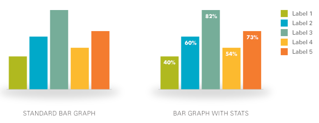
Bar Graphs
Bar graphs should be used when comparing relationships among amounts. Bars are sized relative to the amounts they represent. Vertical bar graphs are best used to convey data over time, while horizontal bar graphs can be used to represent any two variables that share a quantitative relationship.
Bar graphs, like other chart styles, should use the secondary color palette and employ a light shadow beneath the graph. All bars should be of equal width and each bar should have its total displayed. Relevant labels can be placed beside the graph.
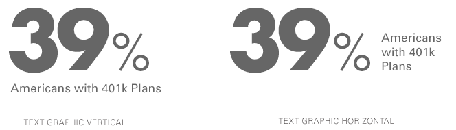
Text-Based Graphics
Using text and typography to present data and statistics can help make information easier to digest at a glance. Use this kind of graphic to visually break up text and data. Text-based graphics can include tables, timelines, and numbers presented alongside explainer text.
When creating a text-based graphic, attention to typography is very important. Hierarchy and color will help draw the eye to important data and should be used with care. Kern any type set larger than 18 points or pixels.